
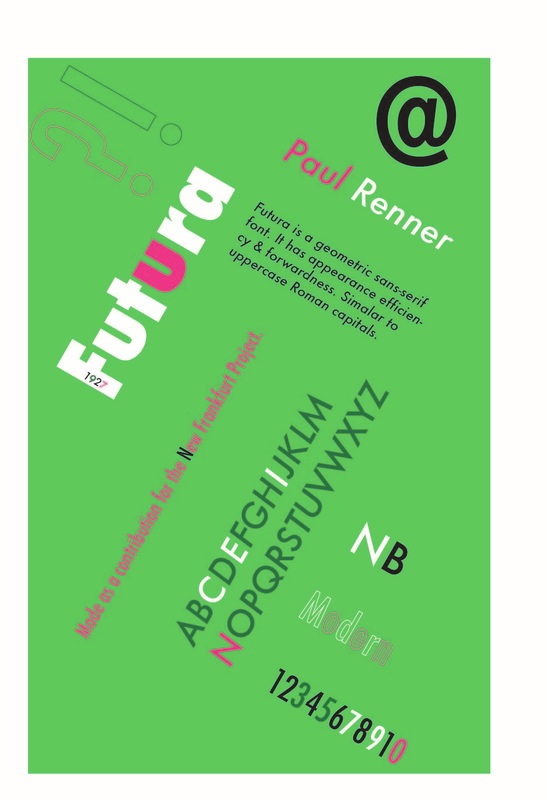
 These two copies above the Mercedes Benz logo aren't direct infridgement, because although they are clearly using inspiration of the original logo, they have been completely been remade to look unique to their own style. Also, a fair use case could be made with these pieces because a fair amount of change was made to the logos-especially in the second picture in the middle which appears to have been completely remade. Font Used-Trajan Pro, represents my low-key attitude, and my modern style.
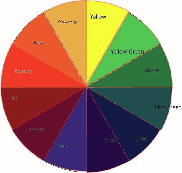
Type of font-Geometric sans? Why does this color represents me-because its exciting,abstract, and valued.  Red- Associated with faster decisions-thus faster bikes! Make you feel exhilarated and excited, great logo color choice. Green-healthy living! Make you feel uplifted which is good for a logo of an activewear brand.  Pink-sweet feminine. Very nice choice for a lingerie brand, makes a vibrant, girly feeling.
Designer's name: Rosie Manning Where she's from: Yorkshire, UK Where she studied: University of Leeds Type of Design she does: product design Work: Not shown 3 Interesting things about Manning:
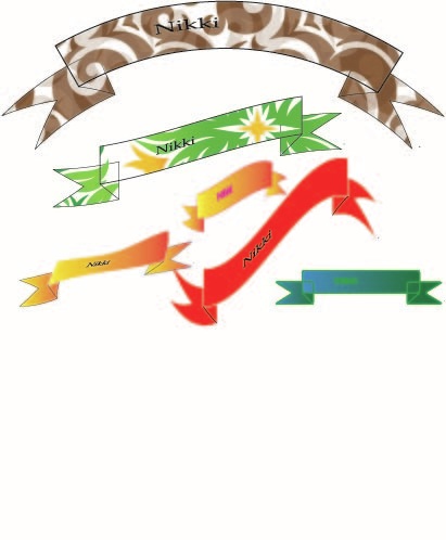
Author: Nikki Behrouz |
AuthorThe aspiring amateur artist and blogger, Nikki Behrouz. Archives
January 2017
Categories |


 RSS Feed
